


|

|
Pada kesempatan kali ini saya akan memberikan trik cara membuat 'Slider Image With CSS3 Animation', dimana pada postingan saya yang lalu pernah juga membahas. Create Images Sliding Panels With CSS.

CSS ::
/* ANIMATION */
@-moz-keyframes cycle {
0% { top:0px; }
4% { top:0px; }
16% { top:0px; opacity:1; z-index:0; }
20% { top:325px; opacity:0; z-index:0; }
21% { top:-325px; opacity:0; z-index:-1; }
92% { top:-325px; opacity:0; z-index:0; }
96% { top:-325px; opacity:0; }
100%{ top:0px; opacity:1; }
}
@-moz-keyframes cycletwo {
0% { top:-325px; opacity:0; }
16% { top:-325px; opacity:0; }
20% { top:0px; opacity:1; }
24% { top:0px; opacity:1; }
36% { top:0px; opacity:1; z-index:0; }
40% { top:325px; opacity:0; z-index:0; }
41% { top:-325px; opacity:0; z-index:-1; }
100%{ top:-325px; opacity:0; z-index:-1; }
}
@-moz-keyframes cyclethree {
0% { top:-325px; opacity:0; }
36% { top:-325px; opacity:0; }
40% { top:0px; opacity:1; }
44% { top:0px; opacity:1; }
56% { top:0px; opacity:1; }
60% { top:325px; opacity:0; z-index:0; }
61% { top:-325px; opacity:0; z-index:-1; }
100%{ top:-325px; opacity:0; z-index:-1; }
}
@-moz-keyframes cyclefour {
0% { top:-325px; opacity:0; }
56% { top:-325px; opacity:0; }
60% { top:0px; opacity:1; }
64% { top:0px; opacity:1; }
76% { top:0px; opacity:1; z-index:0; }
80% { top:325px; opacity:0; z-index:0; }
81% { top:-325px; opacity:0; z-index:-1; }
100%{ top:-325px; opacity:0; z-index:-1; }
}
@-moz-keyframes cyclefive {
0% { top:-325px; opacity:0; }
76% { top:-325px; opacity:0; }
80% { top:0px; opacity:1; }
84% { top:0px; opacity:1; }
96% { top:0px; opacity:1; z-index:0; }
100%{ top:325px; opacity:0; z-index:0; }
}
@-webkit-keyframes cycle {
0% { top:0px; }
4% { top:0px; }
16% { top:0px; opacity:1; z-index:0; }
20% { top:325px; opacity:0; z-index:0; }
21% { top:-325px; opacity:0; z-index:-1; }
50% { top:-325px; opacity:0; z-index:-1; }
92% { top:-325px; opacity:0; z-index:0; }
96% { top:-325px; opacity:0; }
100%{ top:0px; opacity:1; }
}
@-webkit-keyframes cycletwo {
0% { top:-325px; opacity:0; }
16% { top:-325px; opacity:0; }
20% { top:0px; opacity:1; }
24% { top:0px; opacity:1; }
36% { top:0px; opacity:1; z-index:0; }
40% { top:325px; opacity:0; z-index:0; }
41% { top:-325px; opacity:0; z-index:-1; }
100%{ top:-325px; opacity:0; z-index:-1; }
}
@-webkit-keyframes cyclethree {
0% { top:-325px; opacity:0; }
36% { top:-325px; opacity:0; }
40% { top:0px; opacity:1; }
44% { top:0px; opacity:1; }
56% { top:0px; opacity:1; z-index:0; }
60% { top:325px; opacity:0; z-index:0; }
61% { top:-325px; opacity:0; z-index:-1; }
100%{ top:-325px; opacity:0; z-index:-1; }
}
@-webkit-keyframes cyclefour {
0% { top:-325px; opacity:0; }
56% { top:-325px; opacity:0; }
60% { top:0px; opacity:1; }
64% { top:0px; opacity:1; }
76% { top:0px; opacity:1; z-index:0; }
80% { top:325px; opacity:0; z-index:0; }
81% { top:-325px; opacity:0; z-index:-1; }
100%{ top:-325px; opacity:0; z-index:-1; }
}
@-webkit-keyframes cyclefive {
0% { top:-325px; opacity:0; }
76% { top:-325px; opacity:0; }
80% { top:0px; opacity:1; }
84% { top:0px; opacity:1; }
96% { top:0px; opacity:1; z-index:0; }
100%{ top:325px; opacity:0; z-index:0; }
}
/* ANIMATION BAR */
@-moz-keyframes fullexpand {
0%, 20%, 40%, 60%, 80%, 100% { width:0%; opacity:0; }
4%, 24%, 44%, 64%, 84% { width:0%; opacity:0.3; }
16%, 36%, 56%, 76%, 96% { width:100%; opacity:0.7; }
17%, 37%, 57%, 77%, 97% { width:100%; opacity:0.3; }
18%, 38%, 58%, 78%, 98% { width:100%; opacity:0; }
}
@-webkit-keyframes fullexpand {
0%, 20%, 40%, 60%, 80%, 100% { width:0%; opacity:0; }
4%, 24%, 44%, 64%, 84% { width:0%; opacity:0.3; }
16%, 36%, 56%, 76%, 96% { width:100%; opacity:0.7; }
17%, 37%, 57%, 77%, 97% { width:100%; opacity:0.3; }
18%, 38%, 58%, 78%, 98% { width:100%; opacity:0; }
}
.content h1 {
font-size:48px;
color:#000;
text-shadow:0px 1px 1px #f4f4f4;
text-align:center;
padding:60px 0 30px;
}
/* LAYOUT */
.container {
margin:0 auto;
overflow:hidden;
width:980px;
}
/* CONTENT SLIDER */
#content-slider {
width:100%;
height:360px;
margin:10px auto 0;
}
/* SLIDER */
#slider {
background:#000;
border:5px solid #eaeaea;
box-shadow:1px 1px 5px rgba(0,0,0,0.7);
height:320px;
width:680px;
margin:40px auto 0;
overflow:visible;
position:relative;
}
#mask {
overflow:hidden;
height:320px;
}
#slider ul {
margin:0;
padding:0;
position:relative;
}
#slider li {
width:668px;
height:320px;
position:absolute;
top:-325px;
list-style:none;
}
#slider li.firstanimation {
-moz-animation:cycle 25s linear infinite;
-webkit-animation:cycle 25s linear infinite;
}
#slider li.secondanimation {
-moz-animation:cycletwo 25s linear infinite;
-webkit-animation:cycletwo 25s linear infinite;
}
#slider li.thirdanimation {
-moz-animation:cyclethree 25s linear infinite;
-webkit-animation:cyclethree 25s linear infinite;
}
#slider li.fourthanimation {
-moz-animation:cyclefour 25s linear infinite;
-webkit-animation:cyclefour 25s linear infinite;
}
#slider li.fifthanimation {
-moz-animation:cyclefive 25s linear infinite;
-webkit-animation:cyclefive 25s linear infinite;
}
#slider .tooltip {
background:rgba(0,0,0,0.7);
width:300px;
height:60px;
position:relative;
bottom:75px;
left:-320px;
-moz-transition:all 0.3s ease-in-out;
-webkit-transition:all 0.3s ease-in-out;
}
#slider .tooltip h1 {
color:#fff;
font-size:24px;
font-weight:300;
line-height:60px;
padding:0 0 0 20px;
}
#slider li#first:hover .tooltip,
#slider li#second:hover .tooltip,
#slider li#third:hover .tooltip,
#slider li#fourth:hover .tooltip,
#slider li#fifth:hover .tooltip {
left:0px;
}
#slider:hover li,
#slider:hover .progress-bar {
-moz-animation-play-state:paused;
-webkit-animation-play-state:paused;
}
/* PROGRESS BAR */
.progress-bar {
position:relative;
top:-5px;
width:680px;
height:5px;
background:#000;
animation:fullexpand 25s ease-out infinite;-moz-animation:fullexpand 25s ease-out infinite;-webkit-animation:fullexpand 25s ease-out infinite;
}
HTML ::
<div class="container">
<div id="content-slider">
<div id="slider"> <!-- Slider container -->
<div id="mask"> <!-- Mask -->
<ul>
<li id="first" class="firstanimation"> <!-- ID for tooltip and class for animation -->
<a href="#"> <img src="GAMBAR_1.jpg" alt="Cougar"/> </a>
<div class="tooltip"> <h1>JUDULGAMBAR-1</h1> </div>
</li>
<li id="second" class="secondanimation">
<a href="#"> <img src="GAMBAR_2.jpg" alt="Lions"/> </a>
<div class="tooltip"> <h1>JUDULGAMBAR-2</h1> </div>
</li>
<li id="third" class="thirdanimation">
<a href="#"> <img src="GAMBAR_3.jpg" alt="Snowalker"/> </a>
<div class="tooltip"> <h1>JUDULGAMBAR-3</h1> </div>
</li>
<li id="fourth" class="fourthanimation">
<a href="#"> <img src="GAMBAR_4.jpg" alt="Howling"/> </a>
<div class="tooltip"> <h1>JUDULGAMBAR-4</h1> </div>
</li>
<li id="fifth" class="fifthanimation">
<a href="#"> <img src="GAMBAR_5.jpg" alt="Sunbathing"/> </a>
<div class="tooltip"> <h1>JUDULGAMBAR-5</h1> </div>
</li>
</ul>
</div> <!-- End Mask -->
<div class="progress-bar"></div> <!-- Progress Bar -->
</div> <!-- End Slider Container -->
</div>
</div>
Dan Hasilnya seperti berikut.
-

NFS Hot Pursuit
-

Darksiders II
-
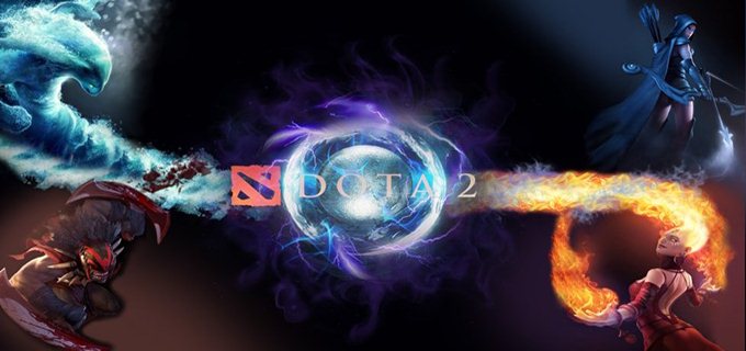
DOTA 2
-

Prince Of Persia The Two Thrones
-

SNIPER Ghost Warrior
Semoga bermanfaat gan. :D
Silahkan anda laporkan jika ada link yang rusak atau beberapa tutorial yang tidak bekerja, karena saya akan segera memperbaikinya, dan berhubung saya baru mengganti themes blog, jadi pasti banyak artikel yang berantakan!
Saya harap anda dapat membantu saya untuk memperbaiki semuanya dengan berkomentar di artikel yang bermasalah..
thanks sebelumnya sudah berkunjung keblog utta yang sederhana ini...
Please rate this article:

{[[' ', '
', ' ']]}
']]}
', '']]}{["Useless", "Boring", "Need more details", "Perfect"]}
Jika Artikel ini menarik, Silahkan copy paste permalink berikut ini di blog sobat!


boleh juga nich slider image yg ini dpasang dtemplate baru punya saya y gan....
BalasHapuskeren...:s
blogmu unik sangat. full CSS
BalasHapus@Qie Art Inside oke gan, nanti pke slider sprti ini :b
BalasHapus@Ahmad Rizal Samsi thanks gan :h
BalasHapushanya satu kata ..
BalasHapus(Keren)
@Dai-detected thanks gan :d
BalasHapusbng Cara memasang css it dmn ??? [-(
Hapus@← Ⓐкα UTτα`
BalasHapusslider itu apa kk